Galactic Starveyor Fonts
 One question I am asked over and over again is, “What fonts were used for Galactic Starveyors?” Great question! Our fantastic design time spent a lot of time developing the overall look that governs every single element of VBS 2017. From the color palette, to the art style, to the perfect stroke on the lettering—every detail was purposefully chosen to bring Galactic Starveyors to life in a cohesive and visually stunning way.
Many of you have asked about the fonts because you also care about keeping the same look and feel of VBS in your custom promotional pieces, video presentations, and recruitment tools. So I’m happy to share that information with you!
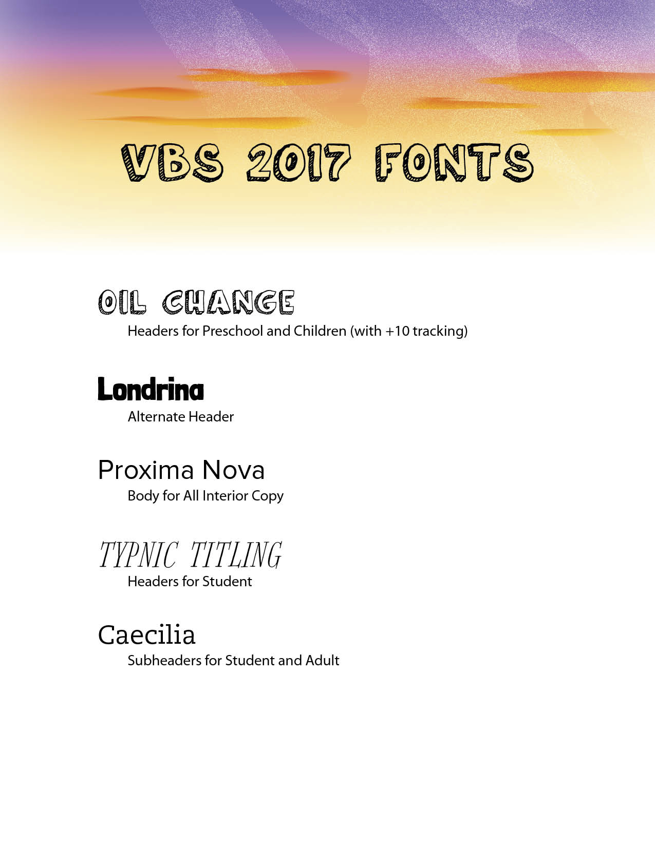
The word “Starveyors” in the VBS logo is hand-drawn lettering done by a very talented illustrator. So unfortunately there isn’t a font available. However, a font such as “Origo” or “Manus” is a good alternative. A font called “Oil Change” was used for the word “Galactic” in the logo and was also used as headers throughout the curriculum. Here’s a handy visual from the VBS 2017 Worship Rally CD Set that shows all of the fonts used in VBS 2017. Enjoy!
How did you get the star above the I in GALACTIC?
It was illustrated and added in Adobe Illustrator.
Where do we get the fonts? Trying to make a save the date.
Search for each font name online. There are many reputable sites that sell fonts.
Thank you so much!